Meridian Timepieces
The problem
Luxury watch brands all look alike — gold on black, serif wordmarks, nothing ownable. Meridian needed an identity that reads expensive in a single glance, before a single word is read.
The approach
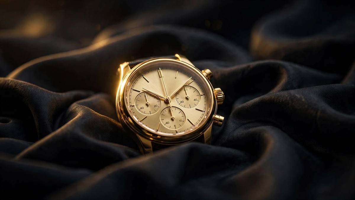
We built the identity around restraint: a sharp wordmark, a champagne-gold palette used sparingly, and campaign art direction that lets the product carry the frame. Nothing shouts; everything signals.
Delivered
- Identity system & wordmark
- Champagne-gold palette & type rules
- Campaign art direction
Skills used
Brand IdentityArt Direction